Who made Greenland look “fattish” and who else was affected?
#mapping_alsomatters #GerardusMercator
• 6 min read Chief Editor

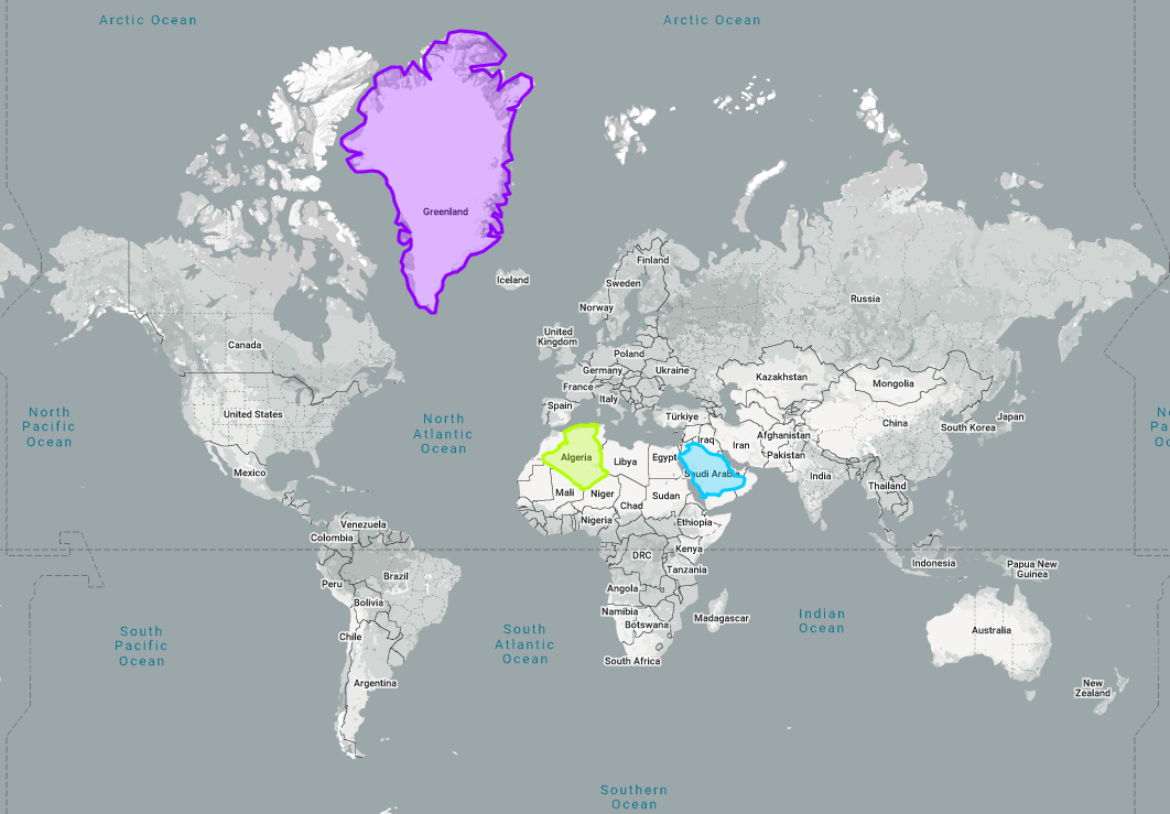
First, how big is Greenland and why do we say it looks somewhat fat? Greenland’s exact area is 2,166,086 km2 which puts it in between Saudi Arabia and Algeria when compared by land area – none of these countries possesses lakes, reservoirs, or rivers within international boundaries and coastlines.
When checking the world map, you will likely see the huge island of Greenland comparable to the whole continents of Africa or South America rather than to separate countries.🤔
This is the result of the map projection presented more 450 years ago being still in use. Known as Mercator’s projection, it is widely used for both digital and printed maps as it preserves the sizes and locations of little objects like streets and buildings – exactly what we look for on daily basis. Together with that, though, Mercator’s projection distorts the landmasses (the closer to the poles, the more) and makes all territories lying higher than Iceland look several times larger than they really are.
Check the map above once again: according to the measurements, Madagascar is in fact two times bigger than the United Kingdom, and Iceland must fit in Madagascar’s area five times. Would you ever tell it from the image?